BPER BANCA
A brand campaign built to make one of Italy's largest banks feel like it actually sees the people it serves.
The Situation
BPER Banca is one of Italy's largest banking groups. The brief was a brand awareness campaign that needed to move the bank's image beyond transactions and products. Not a campaign about interest rates or account features. A campaign about what the bank stands for and who it's for.
Banking advertising in Italy follows a familiar pattern: families in warm light, reassuring music, a voiceover about being close to the community. The work all looks the same. BPER needed to feel different without alienating the audience that banks depend on: ordinary people who want to trust the institution holding their money.
The Approach
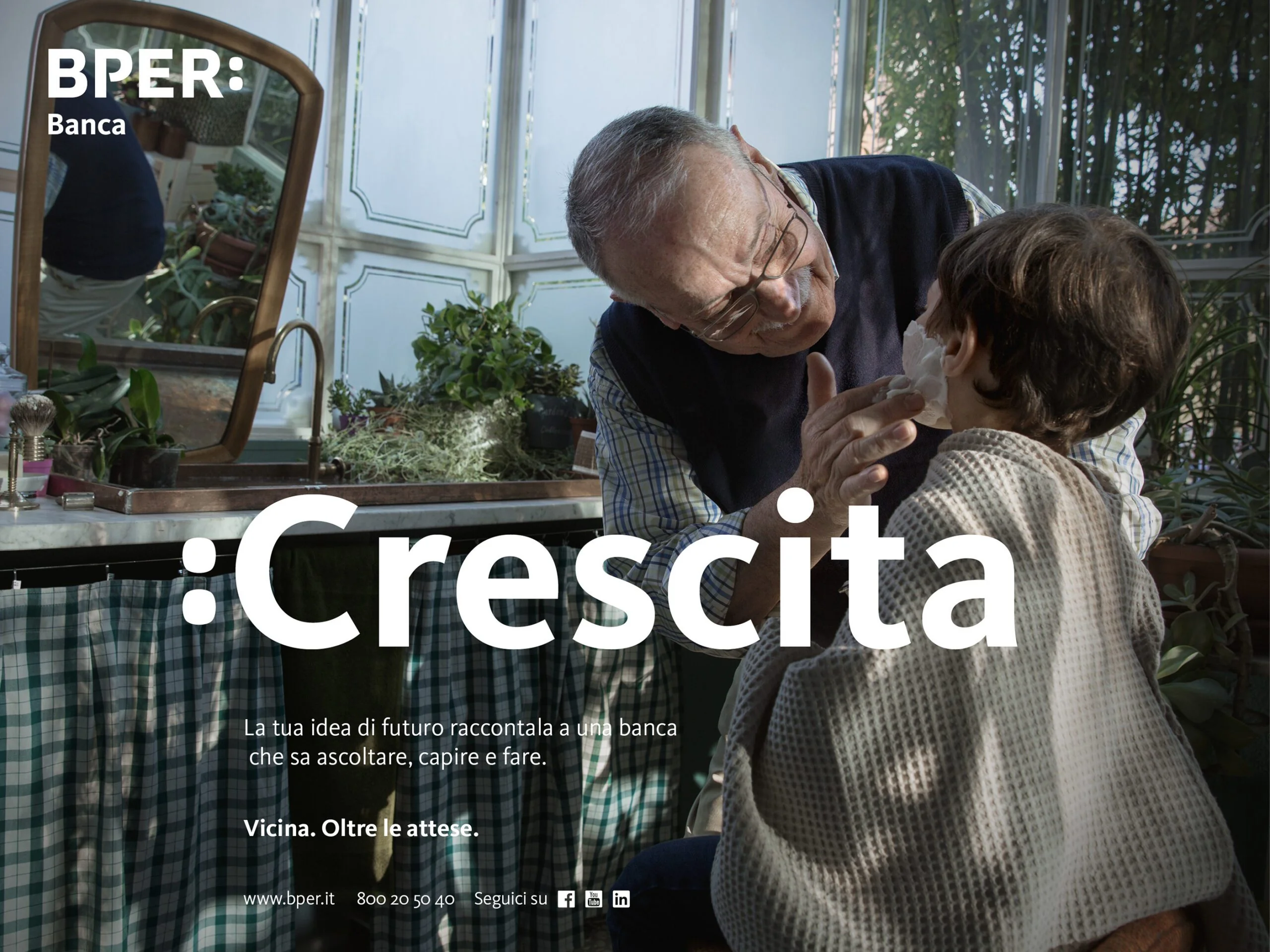
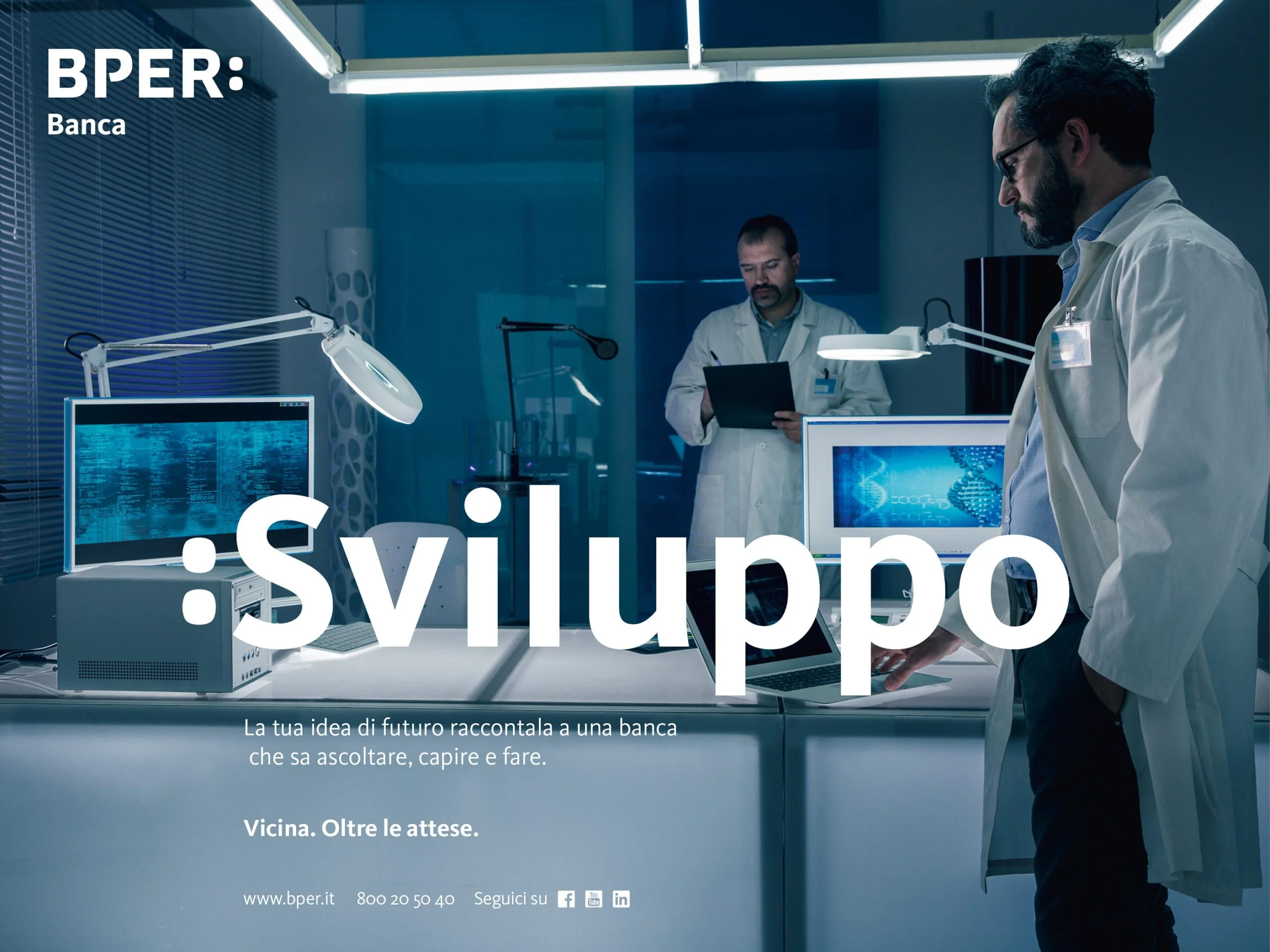
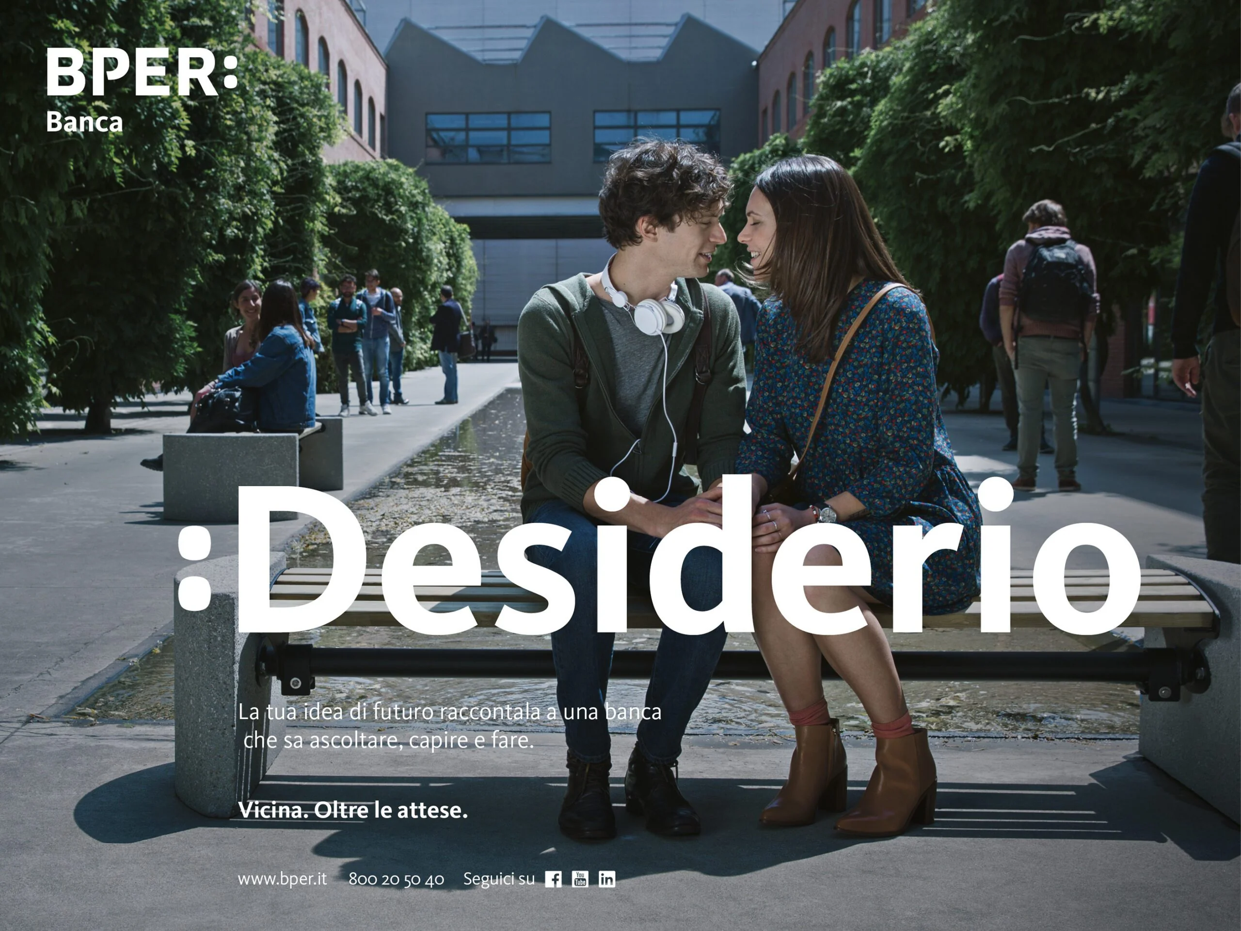
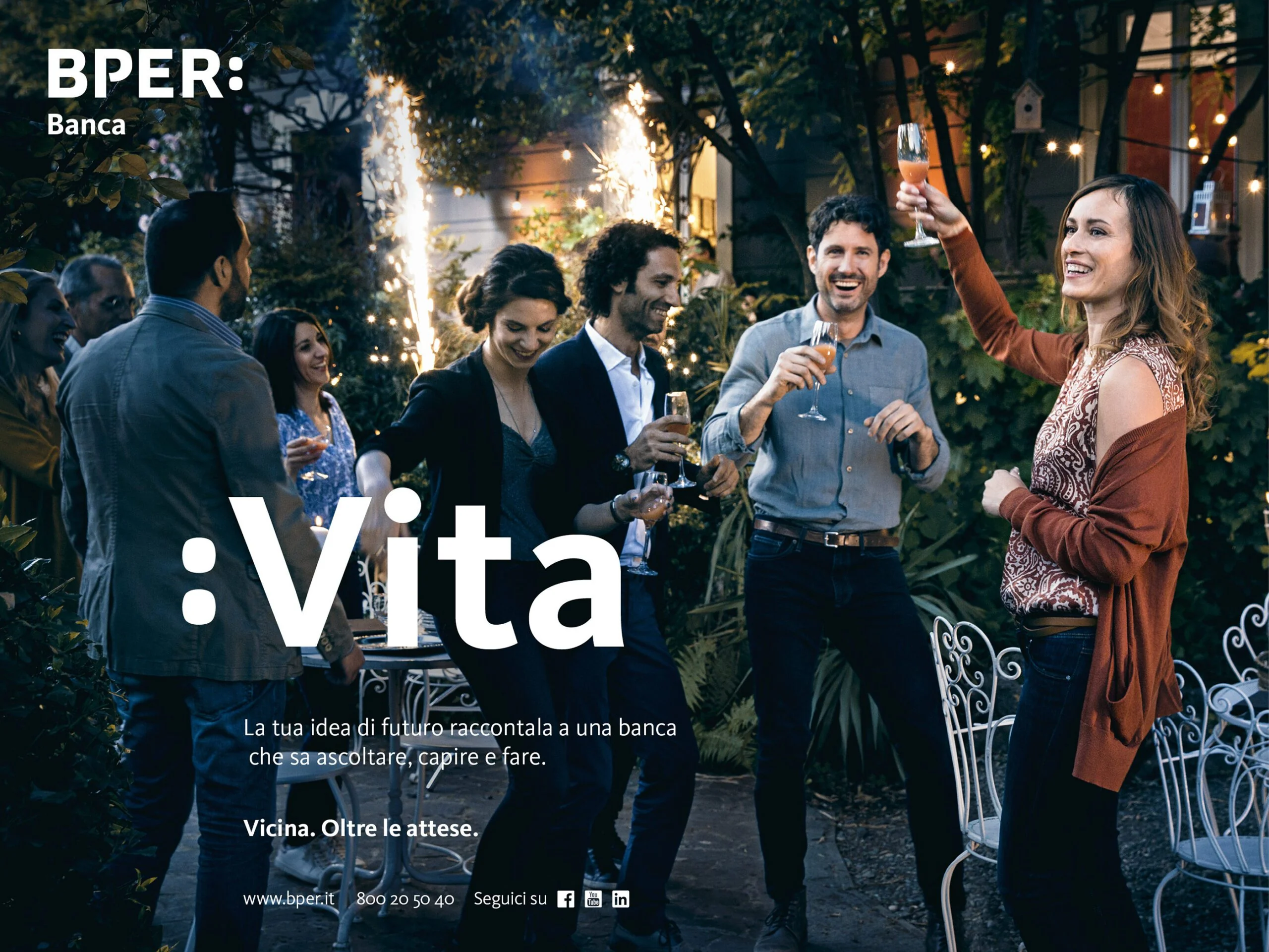
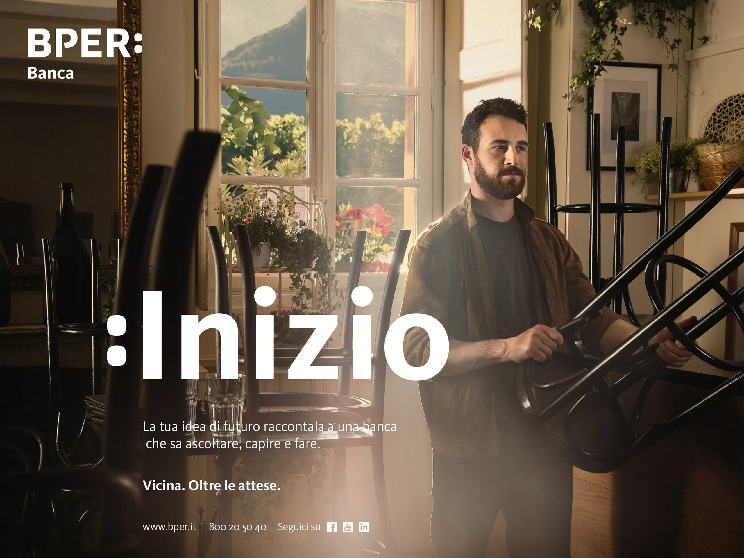
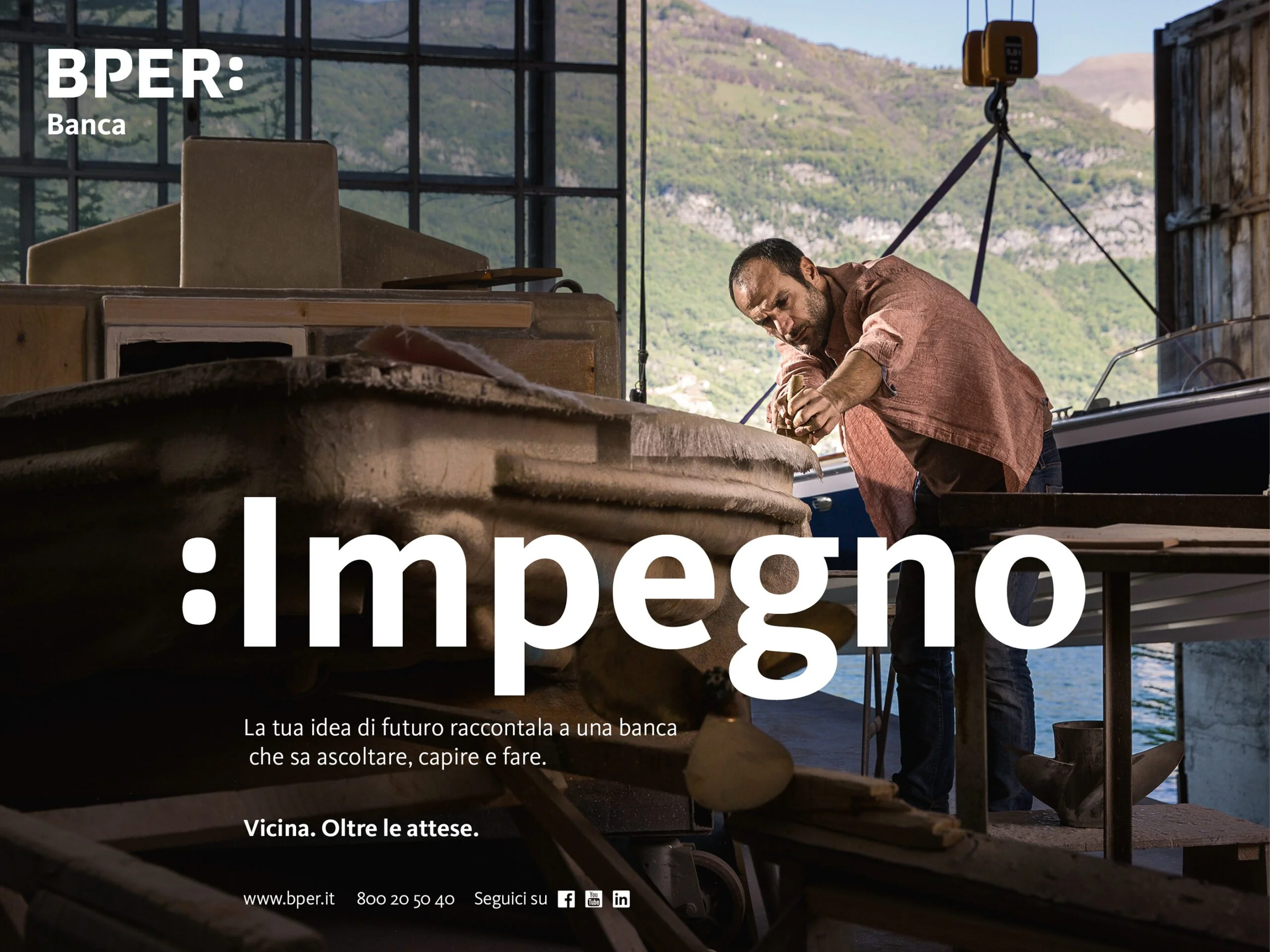
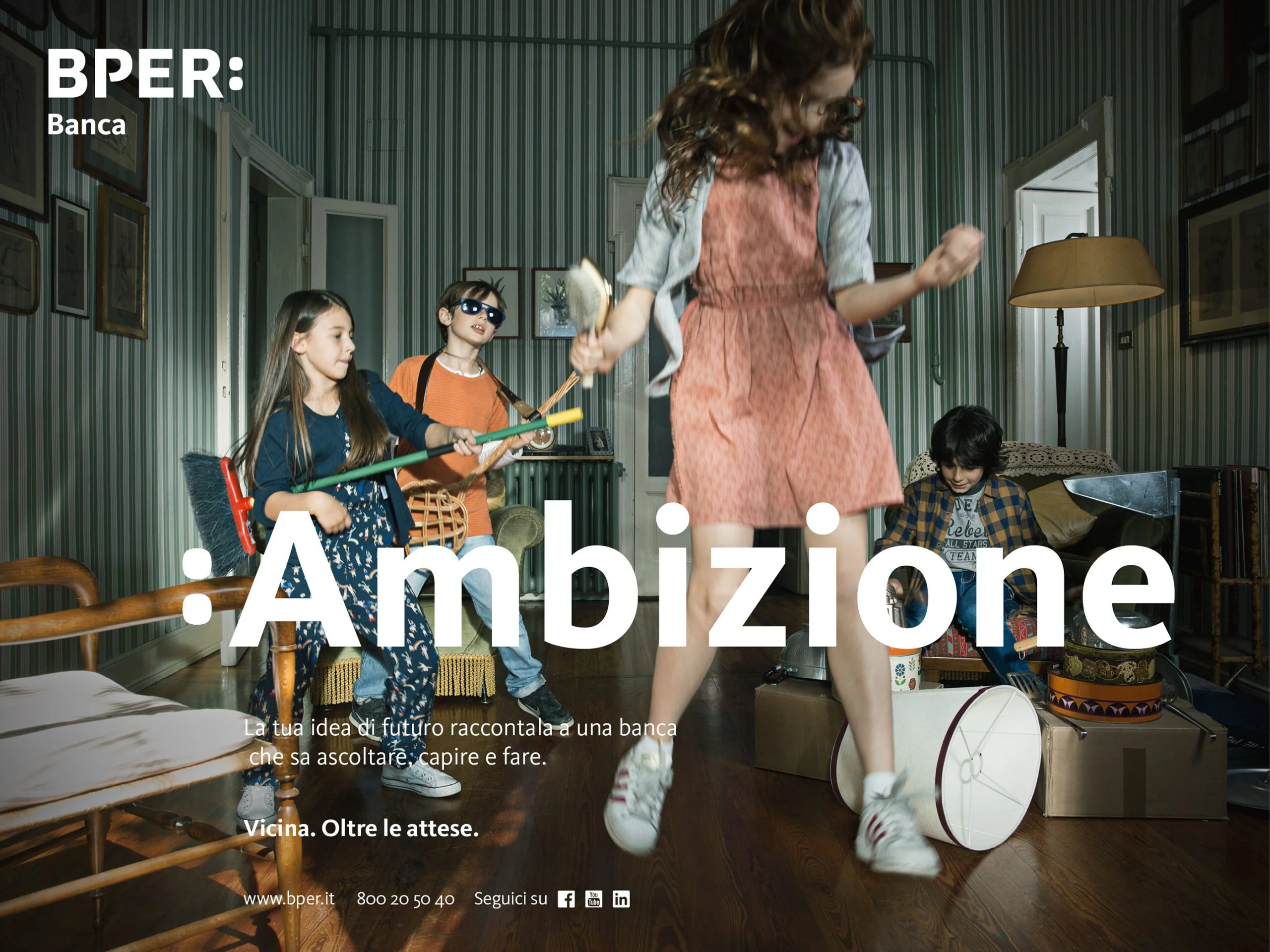
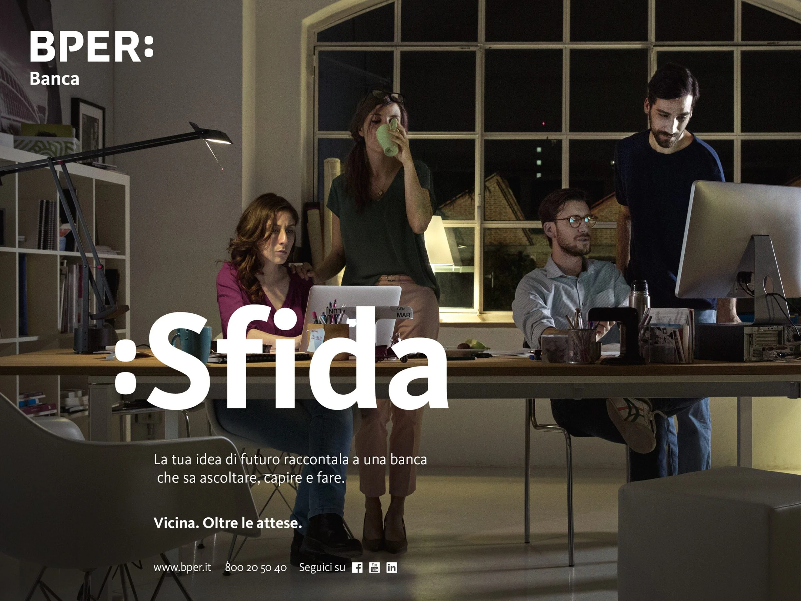
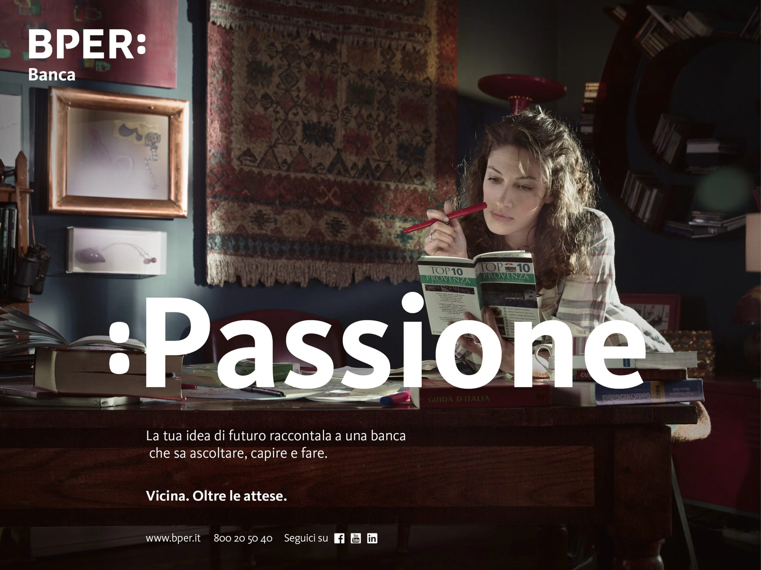
The campaign ran across TVC, print, and photography. I art directed all three. I also shot the print campaign photography myself, which is unusual for a project at this scale, but it gave the campaign a consistency of vision across formats that's hard to achieve when the photographer and art director are different people.
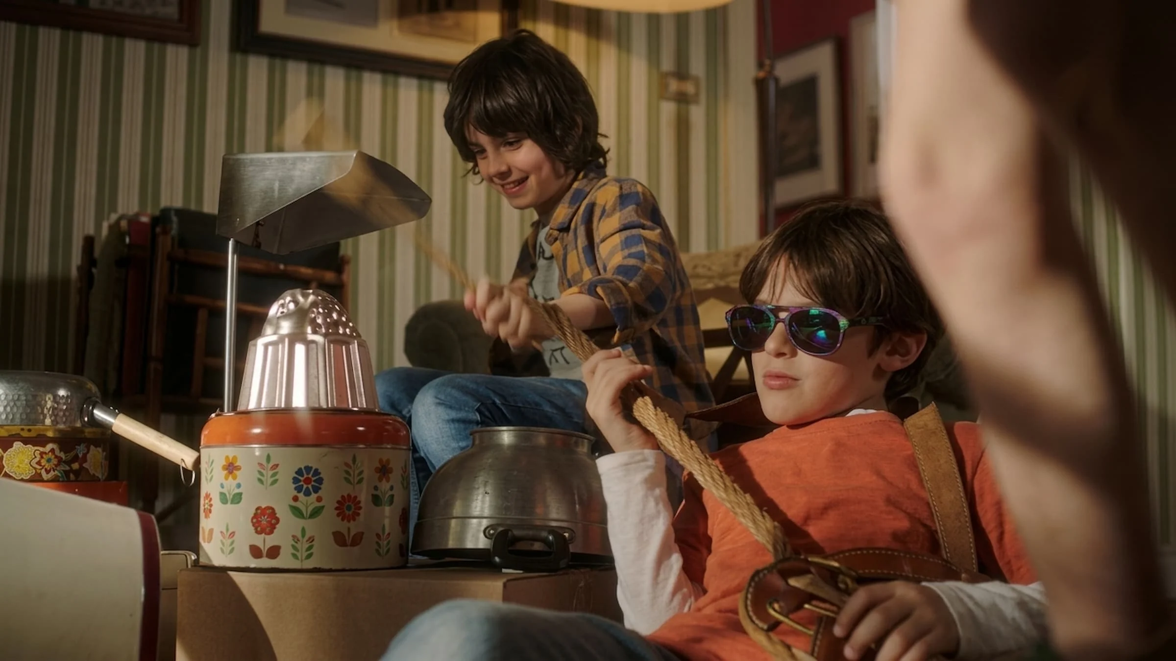
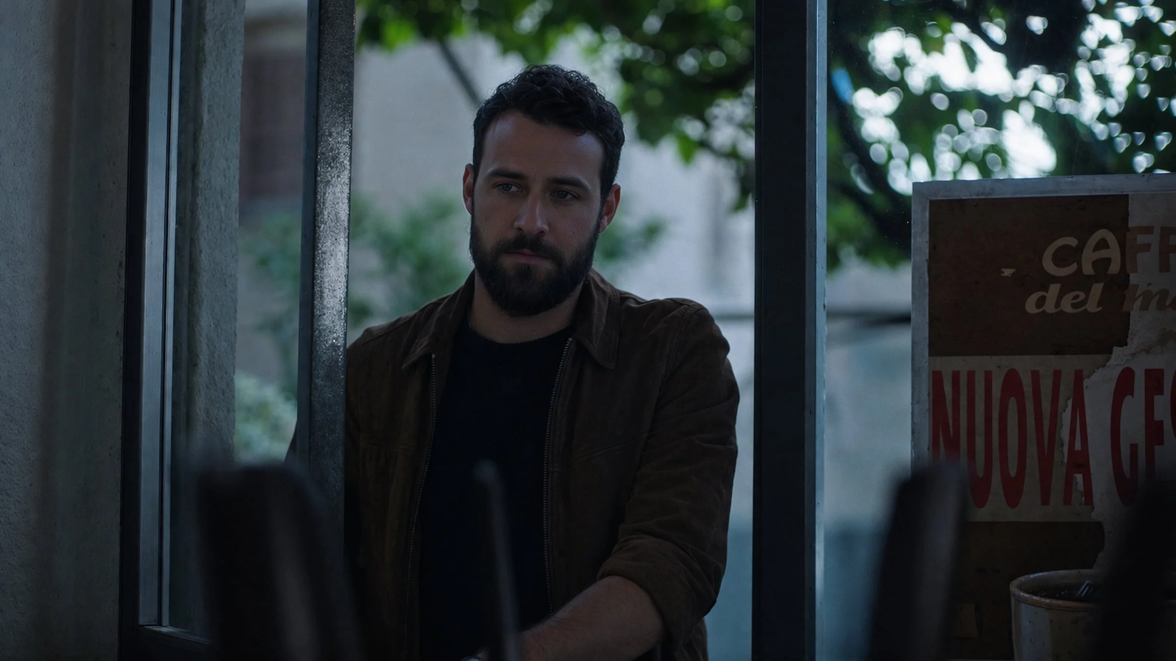
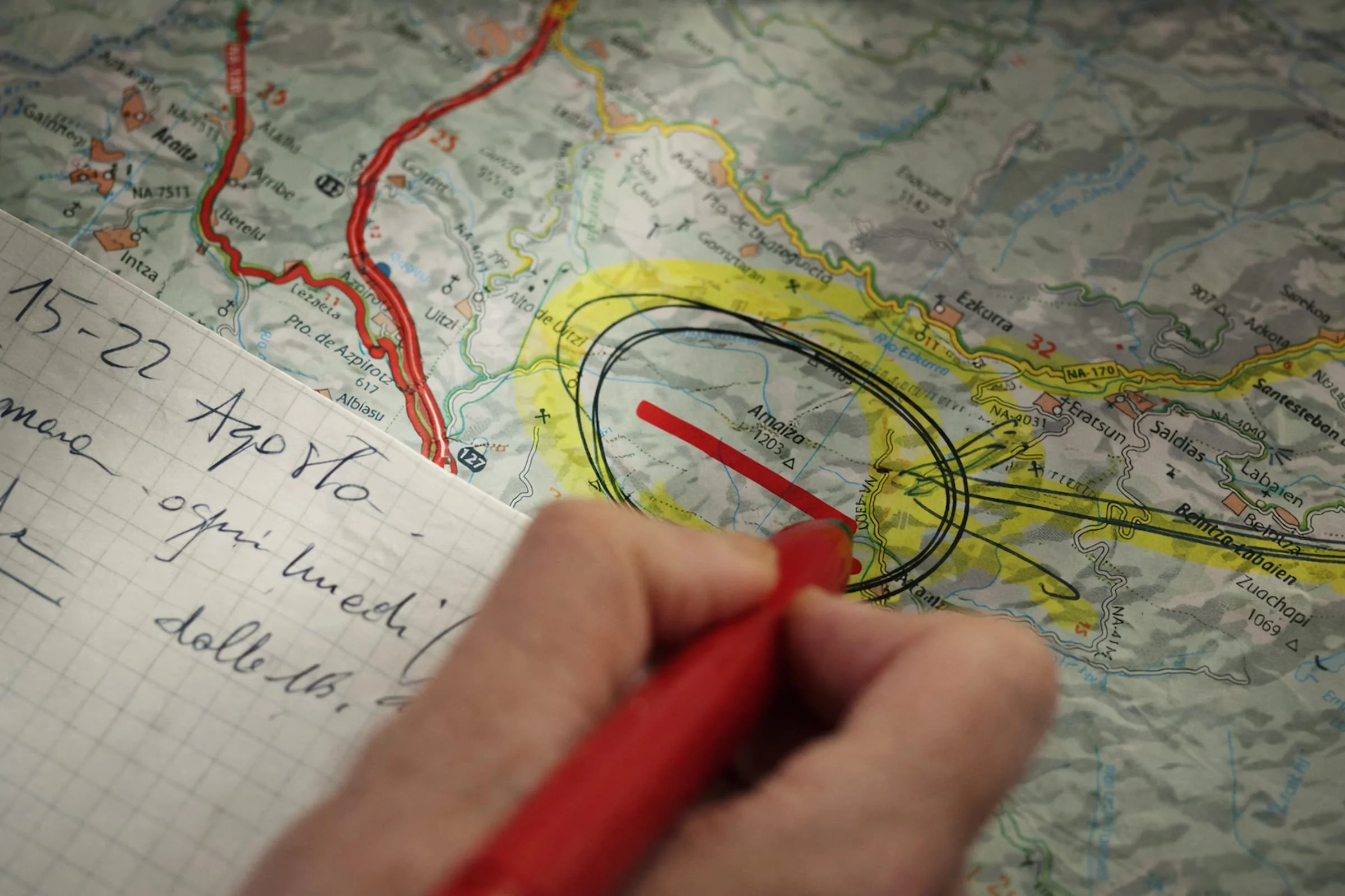
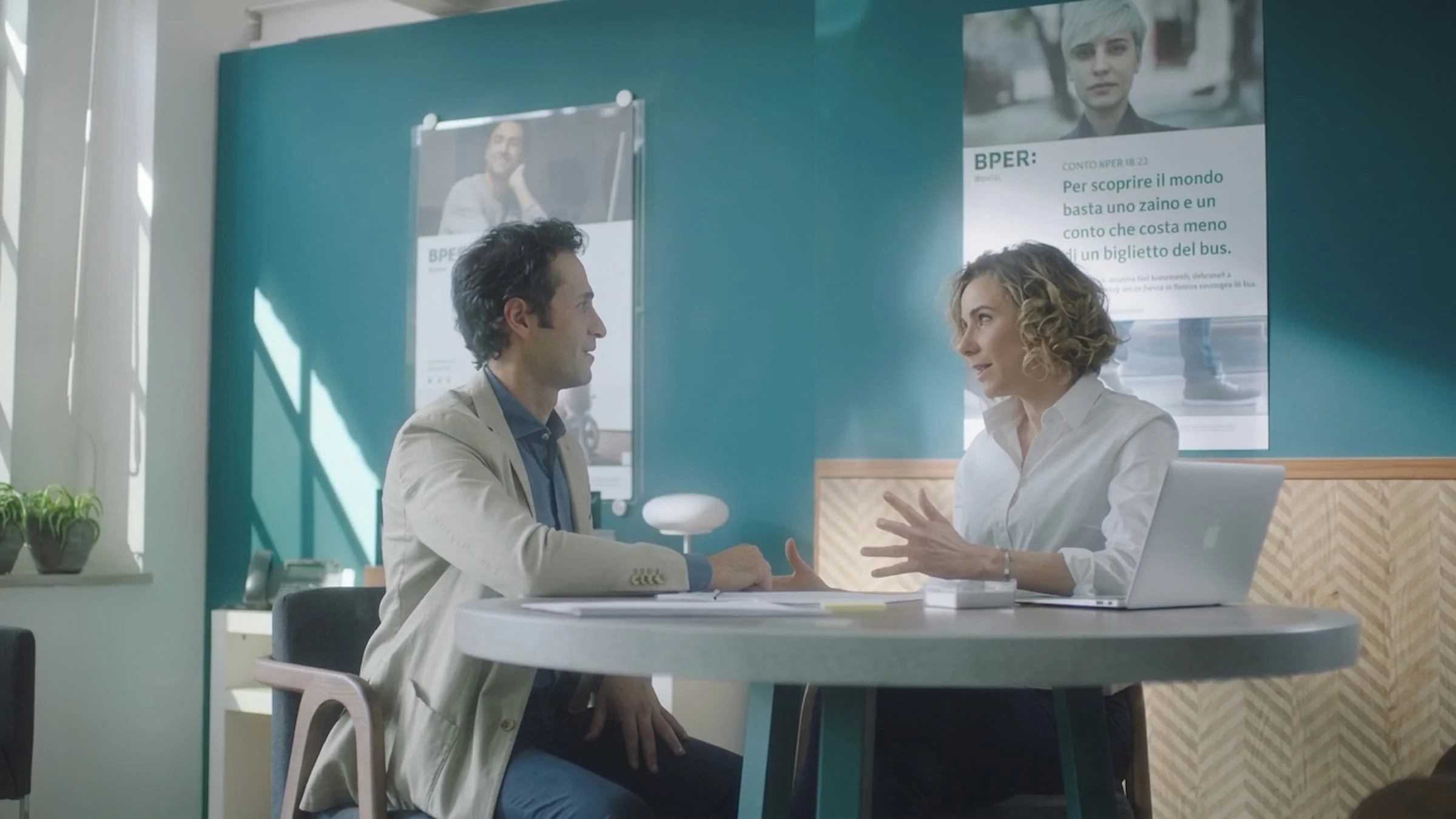
For the TVC, we worked with director Igor Borghi and production company Enormous Film. The film was shot with a cinematic quality that elevated the brand above standard banking advertising. The tone was human and grounded, not sentimental. Real moments, real textures, real light. The goal was to make BPER feel like a bank that actually sees the people it serves, not one that talks about seeing them while showing stock imagery.
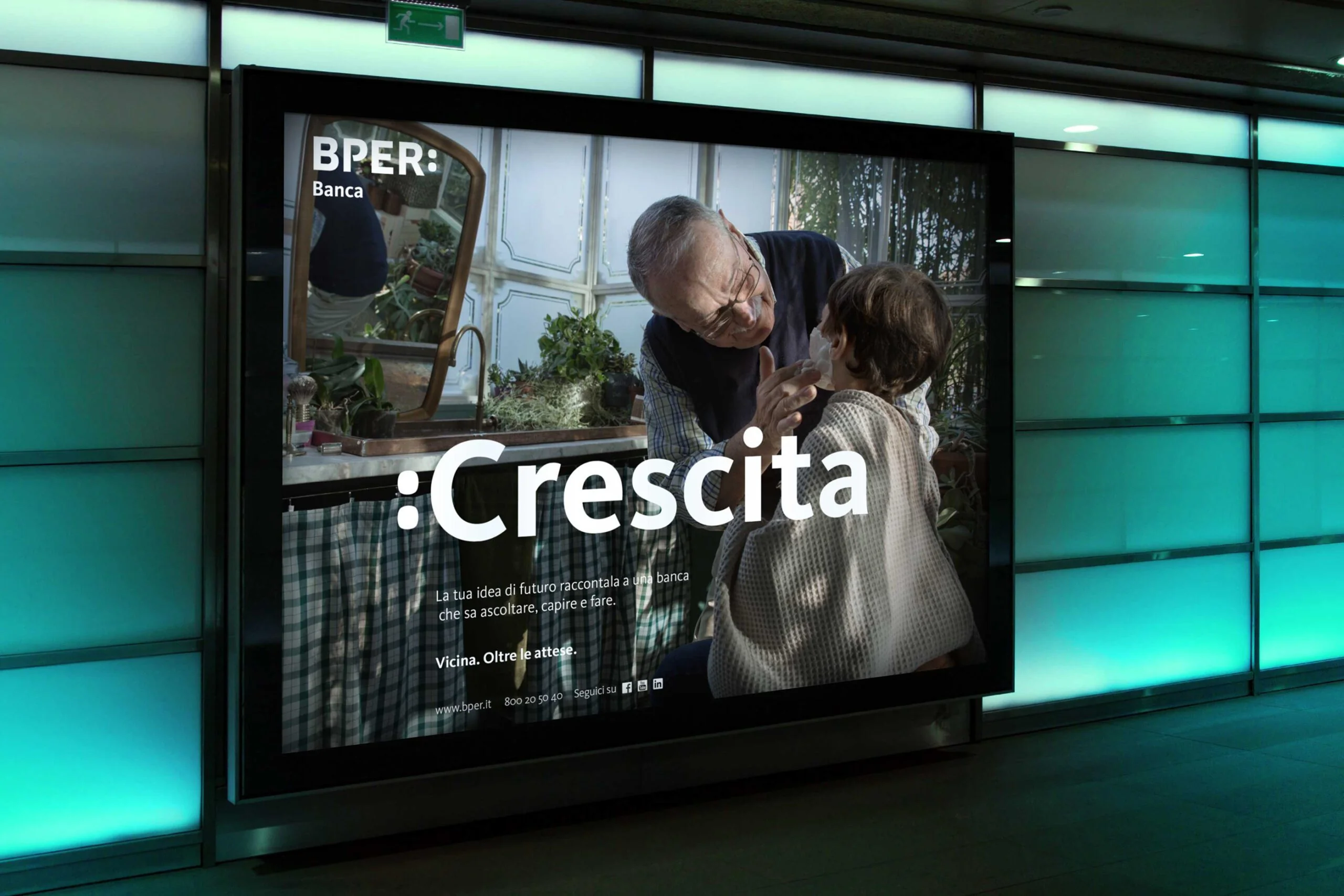
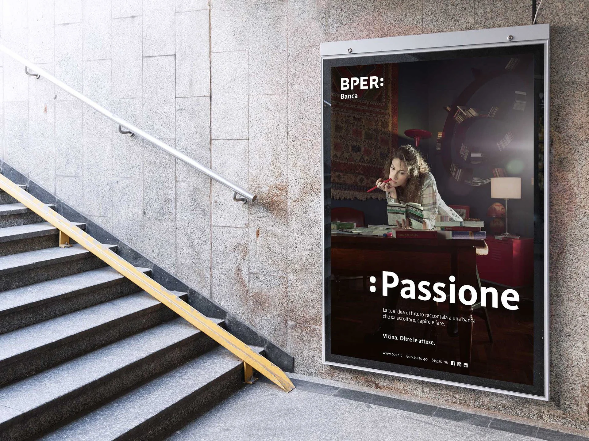
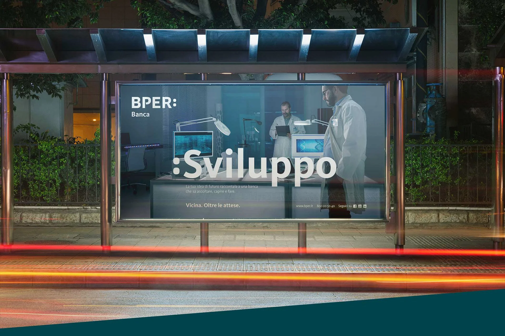
The print campaign followed the same visual language. I directed and shot the photography to ensure the tone held across formats. The images were built around natural light and authentic compositions, avoiding the polished, staged look that banking photography typically defaults to.


The Impact
The campaign gave BPER Banca a brand voice that stood apart from the category. In an industry where most advertising is interchangeable, the combination of cinematic TVC direction and art director-shot photography created a visual identity for the campaign that was distinctly theirs.
The work ran across national television and print in Italy. The fact that I both art directed and photographed the print campaign meant the visual language stayed consistent from screen to page. Something that typically gets lost when different teams handle different formats.
Art Director
Davide Mancini
Copywriter
Sara Repossini
ECD
Giuseppe Mastromatteo
Photography
Davide Mancini
Photo Post-production
Sprint
Production Company
Enormous Film
Director
Igor Borghi
DOP
Gigi Martinucci
Agency
Ogilvy & Mather, Milan